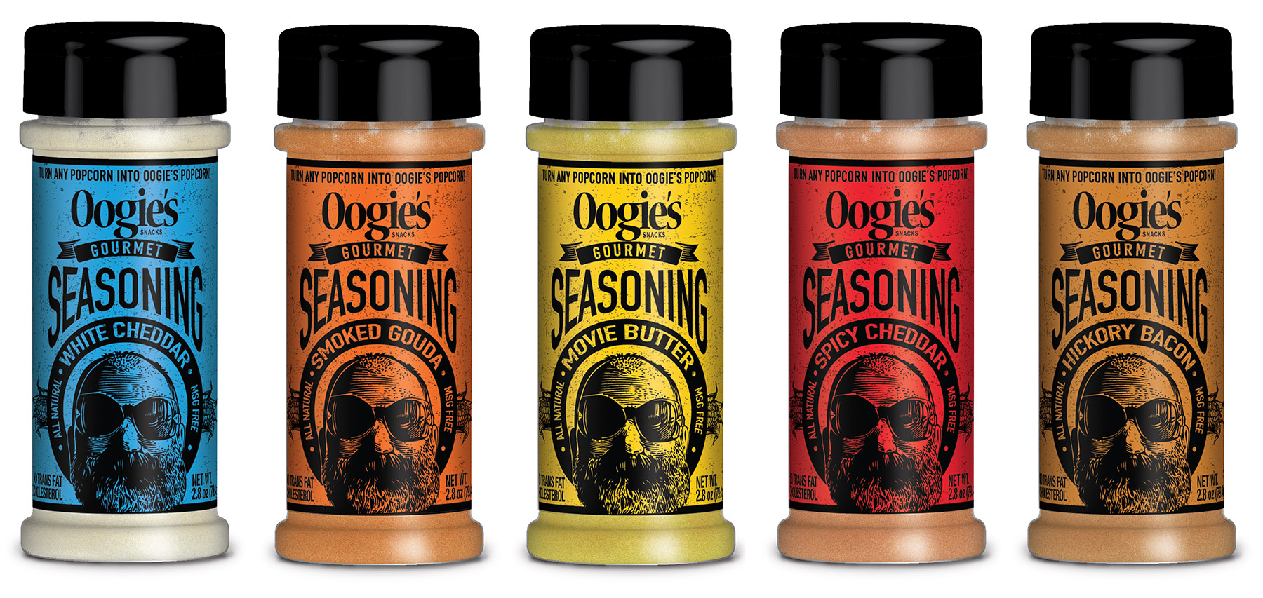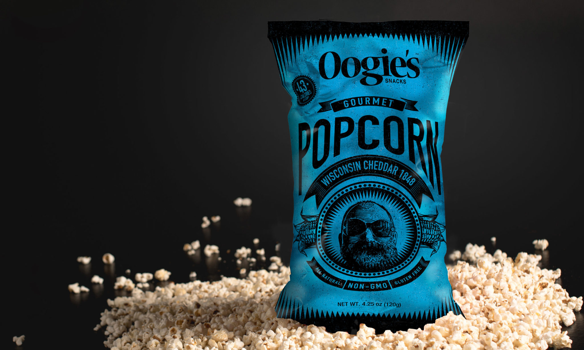

Oogie's Snacks
Dot Matrix designed this third generation of popcorn packaging for the innovative snack company. We created a new, dynamic look and feel for their range of healthy popcorns aimed primarily at gourmet supermarkets. By combing bright colors with a classic woodcut, retro style we created an artisan brand appeal for this individual-batch popcorn.


We've been long-time clients of Dot Matrix, so when it came time to freshen our look and rebrand we didn't need to look elsewhere—we knew they'd do another great job. Of course they ended up doing that and then some.
They listened to what we wanted and understood our vision, offered excellent suggestions and critiques, and really made the whole process relatively easy and painless.
They were able to take our ideas and translate them into incredible designs—from our packaging to sales literature to trade show concepts. Easy to work with, communicative, super-creative, and clever designs—Dot Matrix checks all the boxes you could look for in a design partner.
If you work with Dot Matrix Design Group and your business fails in a spectacular fashion, you can at least take comfort knowing that the packaging wasn't to blame.
— Eric Thier
Founder
Oogie's Snacks LLC