Replenology
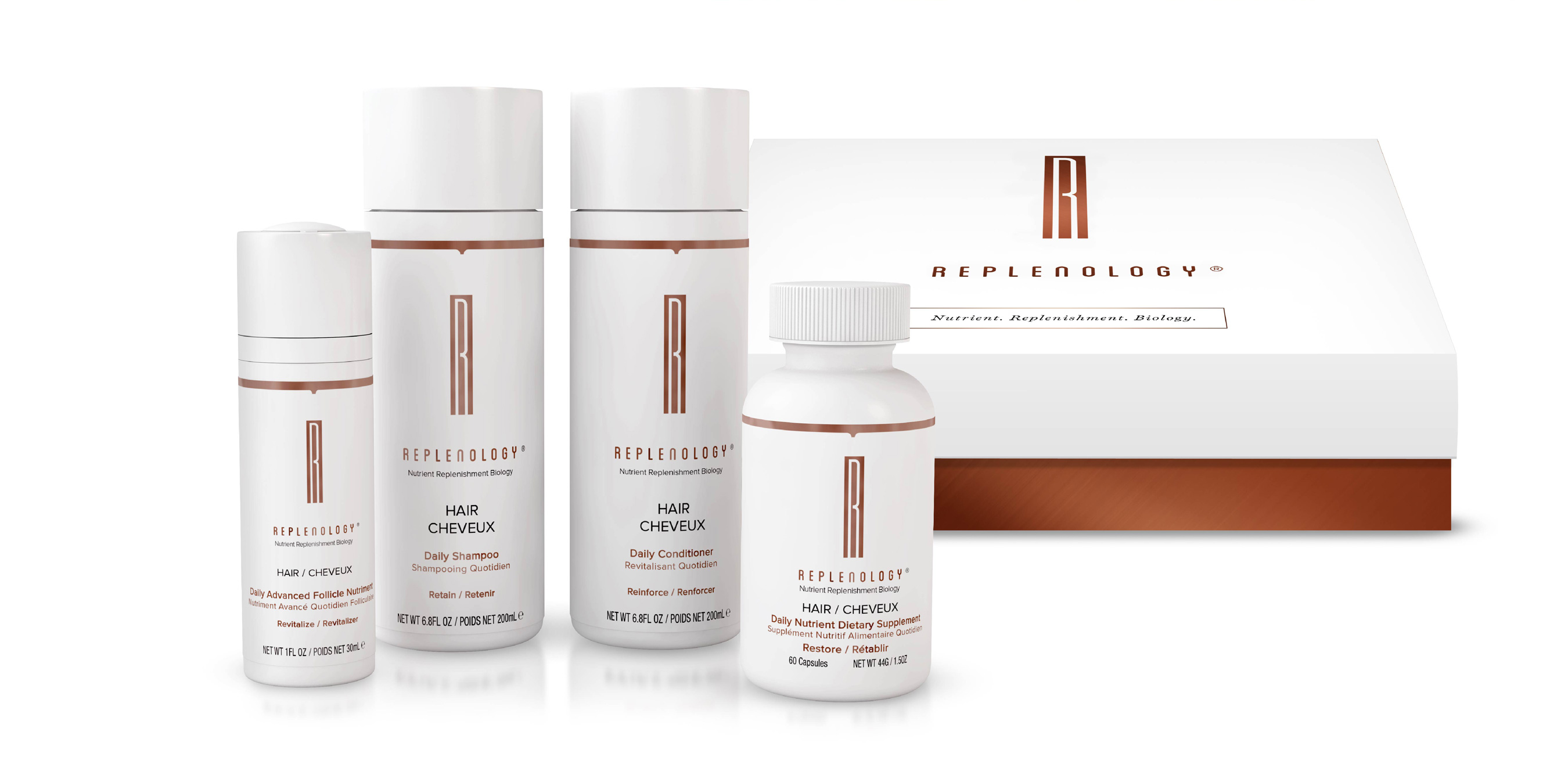
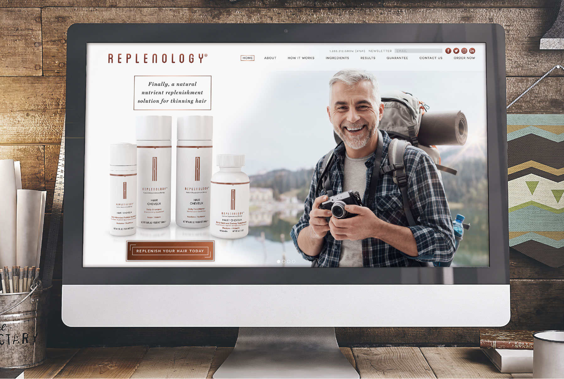
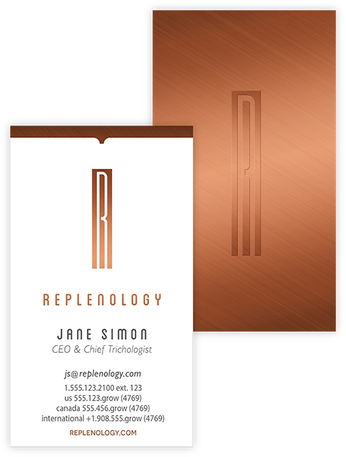
How do you launch a natural, prestige hair-loss product in a market dominated by big brands and "snake oil" gimmicks? This was the challenge we faced when creating the Replenology brand. We combined a modern, elegant logo and color scheme as the anchor for the brand. The package design and shipping box are simple and clean with metallic copper ink and a soft touch to give consumers that prestige experience when they receive their order. Launching first as direct response, we broke the mold of the typical DR website by carrying that prestige feel throughout, and created an effective conversion funnel easily tracked by analytics.
The Dot Matrix team has been an absolute pleasure to work with. They have gone above and beyond our expectations in helping us define our look, match product with vision and produce product branding that we are proud of.
- Peter Feldman
CEO Replenology


