Yo’s Froyo Bites
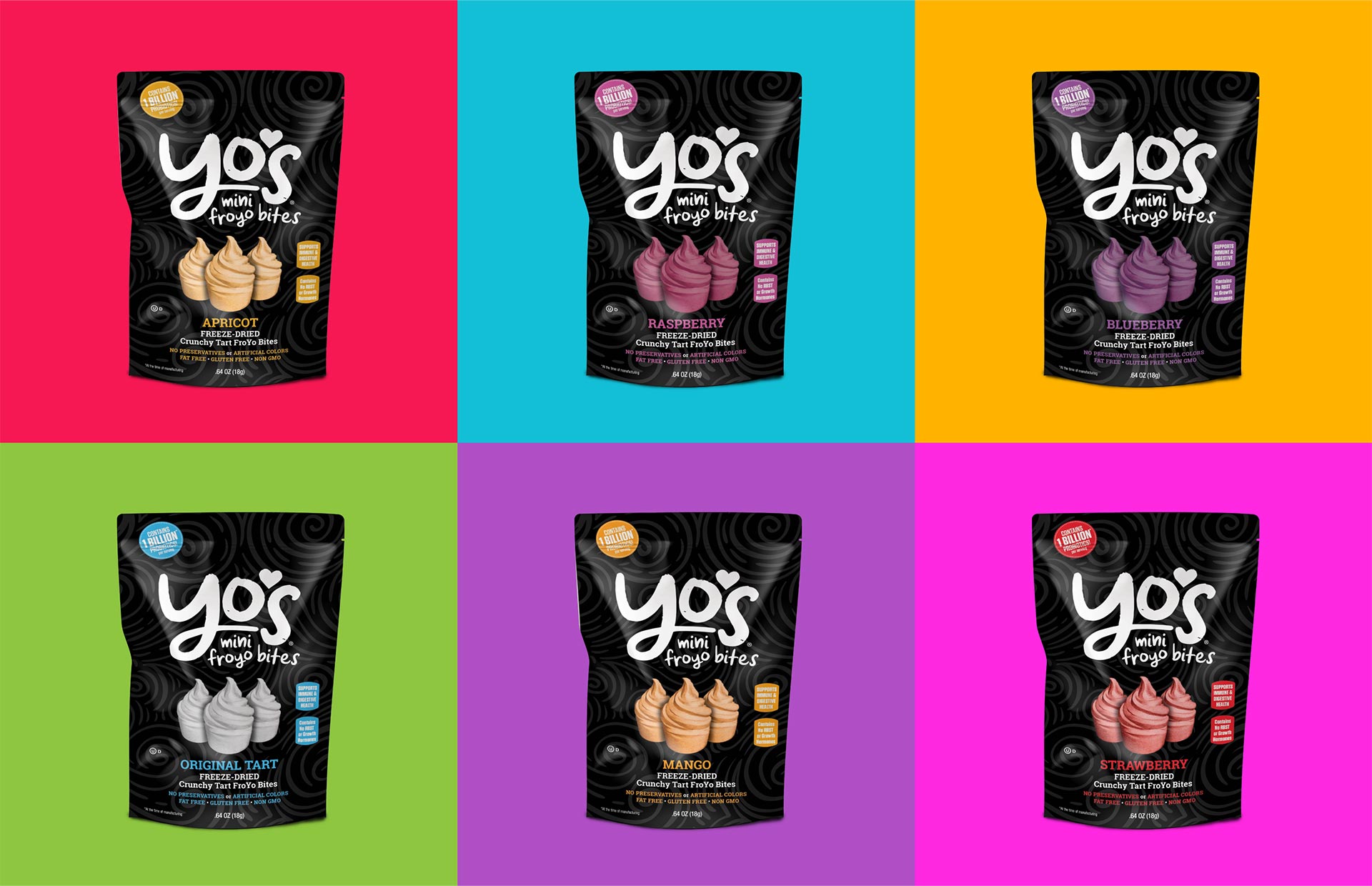
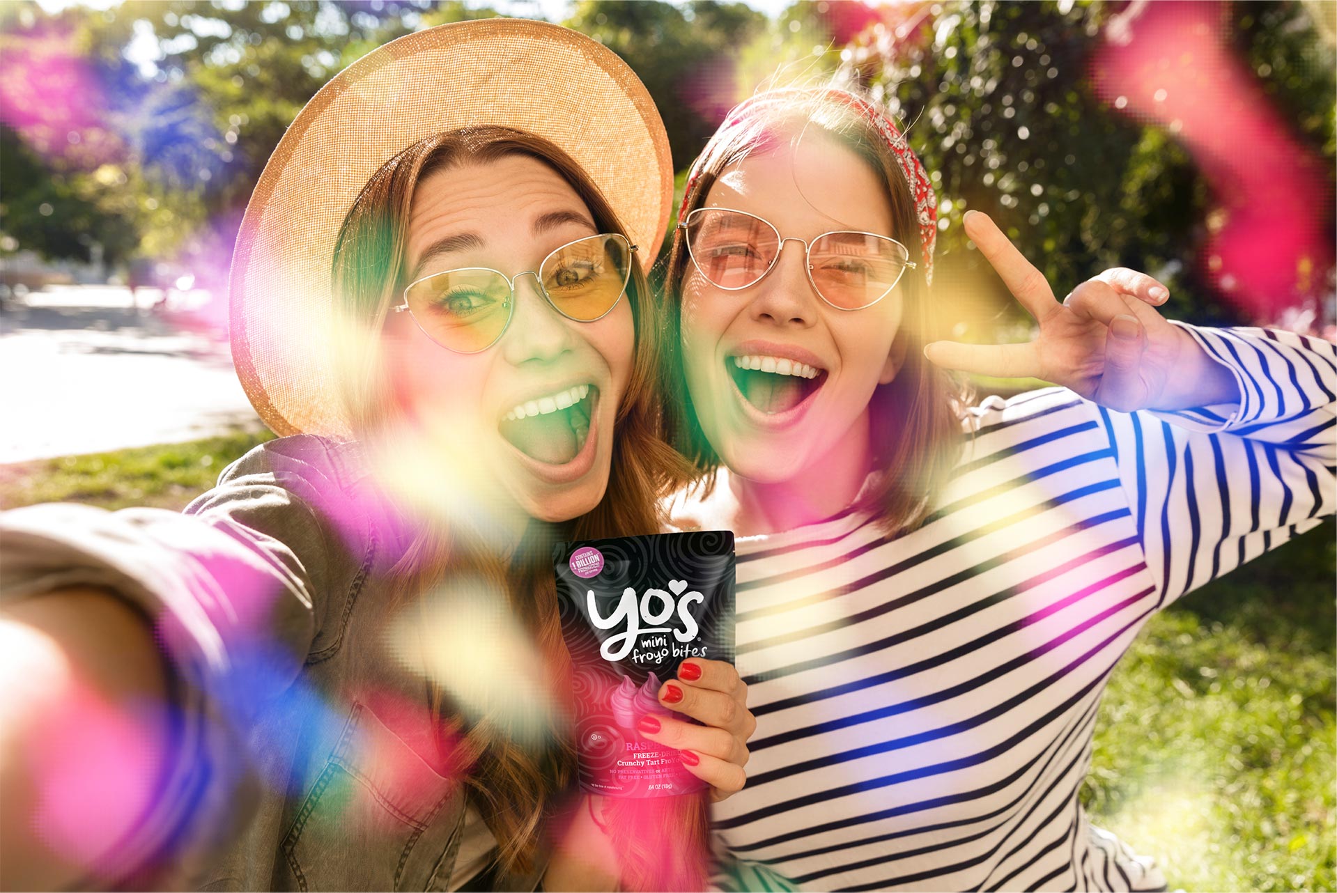
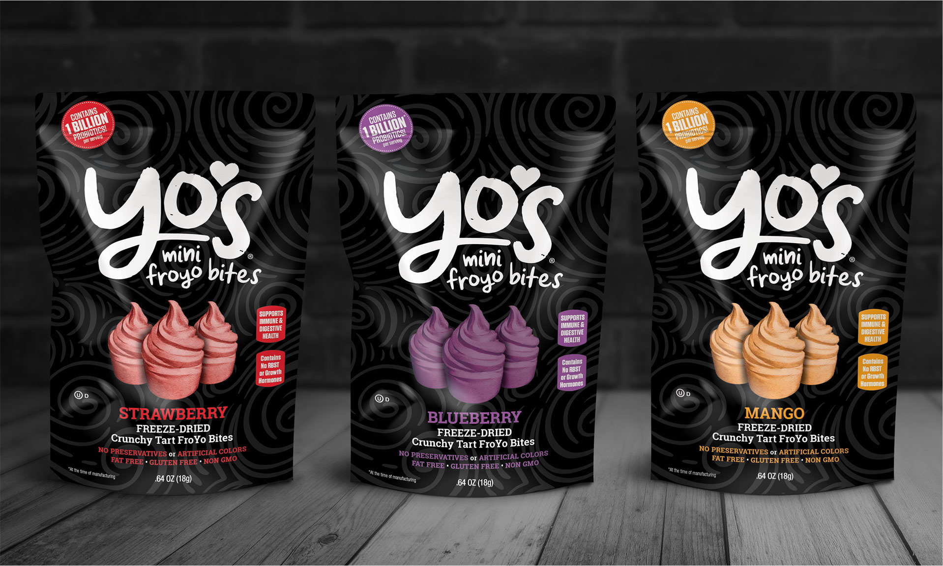
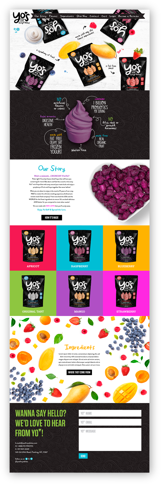
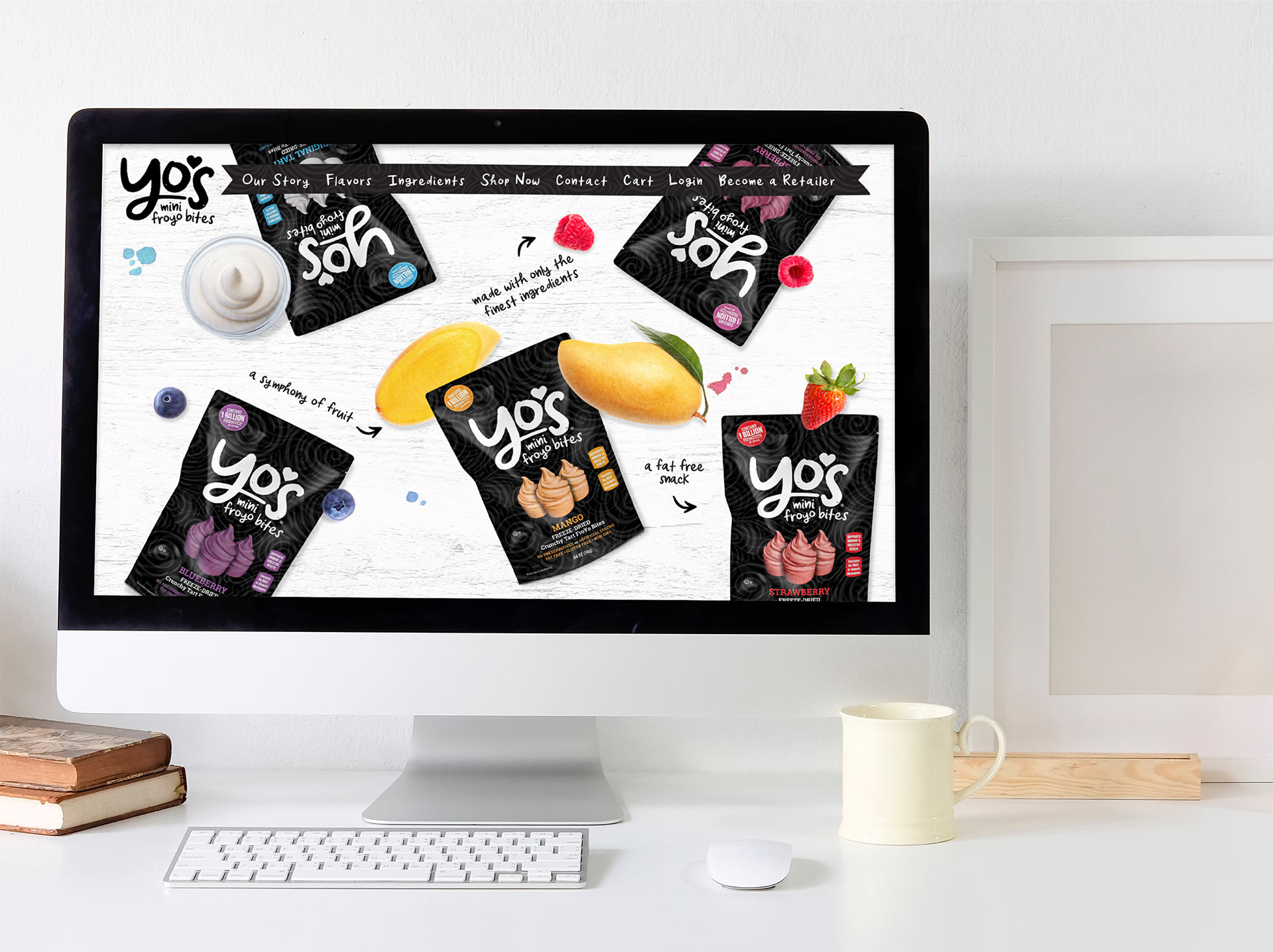
Dot Matrix Design Group embarked on the creative journey with Yo’s Froyo Bites with a clear vision set by the founder – to appeal to young parents seeking healthy snack alternatives. Working closely with the founder, we began by crafting a vibrant logo that perfectly encapsulated the brand’s identity: fun, lighthearted, and friendly. Our commitment extended to the package design, ensuring it resonates with the target audience’s desire for wholesome and enjoyable snacks. At Dot Matrix, we understand the importance of translating vision into design, and Yo’s Froyo Bites stands as a testament to our expertise in creating brands that speak to their intended audience.
Uniting
The World
One Bite
At A Time